When I did a post about a month back about my favorite graphic-friendly fonts, I had a few requests to show what methods I use to combine fonts. I honestly think it's a skill that's just acquired with a lot of trial and error. You really need to play around with fonts to realize what works (and doesn't work) for you. However, I think there are some basic methods to combining fonts that work for pretty much everyone!
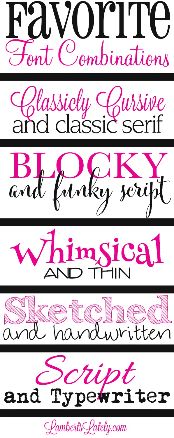
Classicly cursive and classic serif - The keyword in this one is "classic." Keep the mood of your fonts the same, but use different typesets together to achieve it.
Blocky and Funky Script - When you're using a funky, creative script (or funky, unique font of any type for that matter), I think it's important to balance it out with a simple, easy-to-read font.
Whimsical and Thin - When you want a more fun mood in your font, it's still important to balance out the overwhelming with basic. I like to keep a couple of fun, but simple fonts around to balance out the really whacky ones.
Sketched and Handwritten - Noticing a pattern here? I use a really bold, funky font with a more simple font. Really chunky, bold fonts are great to use with handwritten.
(fonts pictured are Archistico and Pea Annalee Script, which unfortunately isn't available anymore. I'm a little heartbroken you can no longer get this font pack.)
Script and Typewriter - This is one example where I do like to pair two kind of bold fonts, but they're balanced. I don't go too thick when I combine two "in your face" font types. Keep the fonts about the same weight (not too bold, not too thin) and they combine wonderfully!
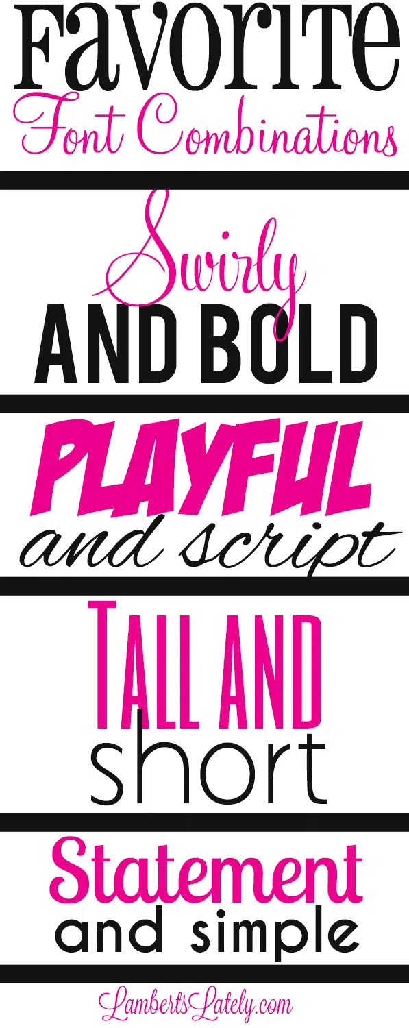
Swirly and Bold - Again, it's all about the weight. If you have one more bold font, use a thinner font to balance it out.
(fonts pictured are Monterey and Bebas)
Playful and Script - This is one exception to my "don't combine moods" rule, but it still has its limits. If you're using playful fonts and script fonts together, make sure the script font isn't too formal.
Tall and Short - combining tall and short fonts adds such a great element to the design. I prefer to keep my emphasized word in a phrase/title as the tall one so it kind of stands out.
Statement and Simple - If you're using a font that has a lot of weight or stands out in a crowd, don't use another font that does the same. Keep the other one simple! Again, I would use the statement font for the main word in a phrase/title. Don't be afraid to use a bold font to balance out the statement one!
A few more tips...
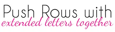
1. Overlap Rows -
One of my favorite ways to add design element to a combination of fonts is to overlap the rows. Especially when you have one part of the letters in a word sticking up (think about the upper portion of an h, or the lower portion of a p), kind of push that into the row next to it. It gets rid of white space in design and makes for a more cohesive look!
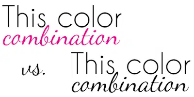
2. Change up the colors -
If you're using two fonts, I'd definitely recommend changing the colors on them as well. It adds so much more dimension to the look of your fonts.
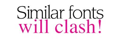
3. Don't put 2 similar fonts together -
It's a huge design no-no to pair 2 similar fonts. You don't want to go completely different in the mood of 2 separate fonts, but you also don't want to pair 2 serif, 2 sans-serif, 2 blocky, etc. Together.
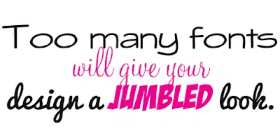
4. Don't overdo it -
This is one of the most common mistakes I see. It looks entirely too jumbled and chaotic to put more than a couple of fonts together. I like to stick to 2, but I'd say 3 is the absolute max I'd use in a font combination. On a similar note, try to keep the "mood" of the fonts similar...you don't want to pair formal with a kid-style font!
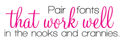
5. Get in those nooks and crannies -
It makes your font combinations look so much more cohesive and "designed" when you fit fonts in those nooks and crannies. Again, going back to the elements of a word that kind of stick out, like the p or the h...stick words between two of those elements in the word below it. It's an easy way to look really professional with your graphics.
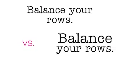
6. Balance your rows -
In the example above, I have the same words and the same font...see how much more cohesive the wording looks when you make sure your rows are even? That might mean making the font on one line a little bit larger, or moving words to the next line. I wouldn't do this if typing out a paragraph, but for a phrase or a title it works perfectly. It also means you can just use 1 font to really add dimension to wording!
I'm open to any questions or comments about all things font...leave them in the comments below!
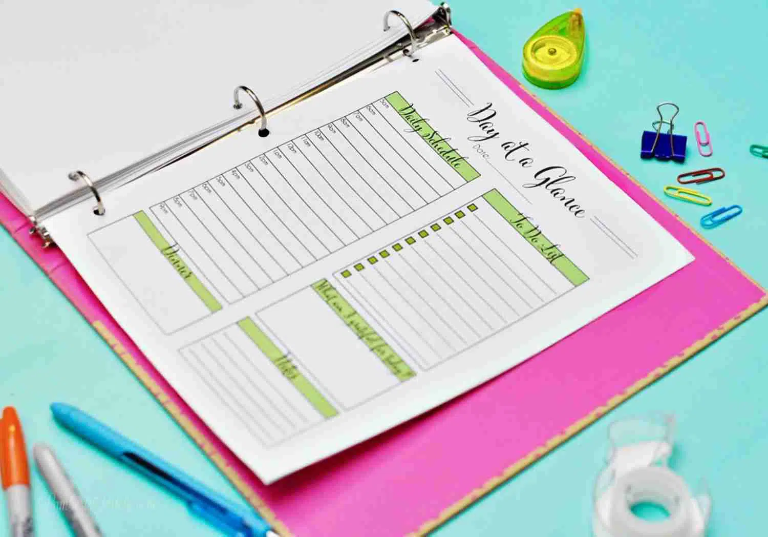
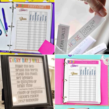
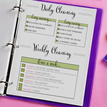
And, if you're looking for beautiful printables with beautiful fonts, I've also got a great set of printables for that. The Year of Intent Planner has over 100 pages of organization printables that allow you to make your own customized planner. There are resources for schedules, goals, finances, projects, and more - this is a huge collection of organization resources, all in one place! Click here for more information.
(And, click here if you're looking for a copy of my summer chore chart for kids!)

Hey there.. just found your blog yesterday and since I'm new to the Cricut family, it's fun learning from someone that sees creativity the same way as myself! Question, are these fonts free to download from the site FontSquirrel.com? If so, exactly how many can I download free? I am trying to figure all of this out and I know I will be a pro soon but right now, I'm punching myself out of a paper bag that's dry as a bone! Thanks again for the wonderful blog and all the great information, tips and projects.
When I published this, all of the ones available from font squirrel were free! Most are from fontsquirrel, which allows unlimited downloads (you don't even have to sign up). It's a great resource. There are a couple in this post that do cost money, but check out my other font post (linked at the top of this one) for another collection of free fonts.
Hey Charlie I just found this site also. I am new to Cricut. What program do I use to download free fonts for Cricut? Any help would be appreciated.
Audrey
What fonts did you use in the title “Favorite font combinations”?
The "Favorite" is Pharmacy (which I believe is a free font) and the "Font Combinations) is Monterey (I think that one is paid).
Thank you! 🙂
I love this! Would you please share which font you used for Lately in "Lamberts Lately?" Thank you so much!
That one's my favorite! (Obviously. 😉) It's called Lavanderia.
I just found your site through Pinterest. I love your font combinations as well as the way you fit them together to look like a cohesive unit. I do handmade cards and like to mess around with creating my own sentiments to put on them. I have a problem with getting my different fonts to "fit together" without too much vertical space separating them.
My question to you: How do you control the vertical space so you can get the words as close together as you want? I usually work within a Word document. Any help you can offer would be appreciated!
I fit my fonts together like that in photoshop...sometimes it requires two separate font layers, but I typically just do it by reducing the lead size on a font layer (that's done by reducing the number under "leading" at the bottom when you have your font layer selected and ready to input text). I do believe it's possible to do it in Word, but it really can't easily be done to small sections of text like it can be done in Photoshop.
This is a great post! Easy and effortless to understand. I've been working on my hand writing styles and everything in your still applies. Thanks for your time! 😁🗒✒🖊✏
*article
Leslie, great blog. This is one of the few articles I printed to refer to often. I'm a newbie so any help is much appreciated.
Here's my question ...
How do you keep track of your font/styles in Cricut? For some reason, my filter doesn't work (so I can't see "my fonts," etc ), nor does "System." Do I need to sync/set something up to remedy this? I've downloaded a few fonts but can never remember their names or easily find them.
Many thanks and keep up the great work!
Unfortunately, I use a silhouette, so I'm not familiar with Cricut software. There should be a folder on your computer that allows you to see all of the fonts at once though - it depends on your operating system.
Hi,
I'm trying to learn how to do fairly simple designs for a website I'm launching soon. This information was really helpful. I'm wondering if you might have any tips and tricks on balancing text that you might be willing to share. I have no formal graphic design training and I'm really struggling with fonts.
Thanks so much!
Hi Elizabeth, I'll be glad to answer anything not discussed in the post, just let me know what questions you have!